The Language of Colors in Branding
The famous painter Robert Motherwell once said: ”Color is the language that the whole world understands.”
This means you don’t always need grand words to explain your brand’s message; sometimes, just the right color is enough.
We often believe a brand is defined by its name or its work, but the truth is that our eyes process colors long before they read words. Every industry has its own vibe, and that vibe is expressed through its color palette. From the professional coolness of Tech to the high energy of the Food industry, picking the right color is the secret to a brand’s success. In a market filled with thousands of competitors, some brands are recognized instantly just by their colors. Color isn’t just a design choice; it is your brand’s identity that sets you apart and makes you unique.
The Psychology Behind Your Brand’s Color Signature
Your brand color isn’t just a “design choice” it is a silent identity for your business. Research shows that the human brain processes colors before words, creating a deep, subconscious connection between your brand and your customer.
Immediate Recognition: The Starbucks Effect
Have you ever wondered how you recognize a Starbucks cup without even reading the name? It’s often just that distinct Dark Green straw. This is the power of a “Color Signature.” When you select a unique, specific color and use it consistently across every touchpoint, your brand becomes etched in the minds of your audience. It doesn’t just differentiate you from the competition; it fosters a deep sense of Brand Loyalty among your customers.
The Science of Decision Making: (60-80% Impact)
It might surprise you to learn that globally, 60% to 80% of purchasing decisions are influenced by color alone. In markets like the USA and Canada, 90% of consumers admit they judge a product and decide whether to buy it based solely on its color palette. Colors do more than just please the eye; they act as psychological “triggers” in the brain. Consider this: if your favorite chocolate came in a colorless, bland wrapper, or if your favorite tech giant’s logo was strictly black and white, would it still spark the same desire to buy? Likely not. Psychology suggests that people form an opinion about a product within the first 90 seconds of viewing it and color is the primary driver of that judgment.
Non-Verbal Communication: A Silent Message
Your “Color Signature” is a silent message that tells your consumers exactly who you are without saying a word. Are you a serious, Corporate brand? Or are you a high-energy, Creative agency?
Choosing the right colors is essential to ensure that the message you send aligns perfectly with what your customers want to hear. If the colors are mismatched, that crucial “Bond” between the brand and the customer will never truly form.
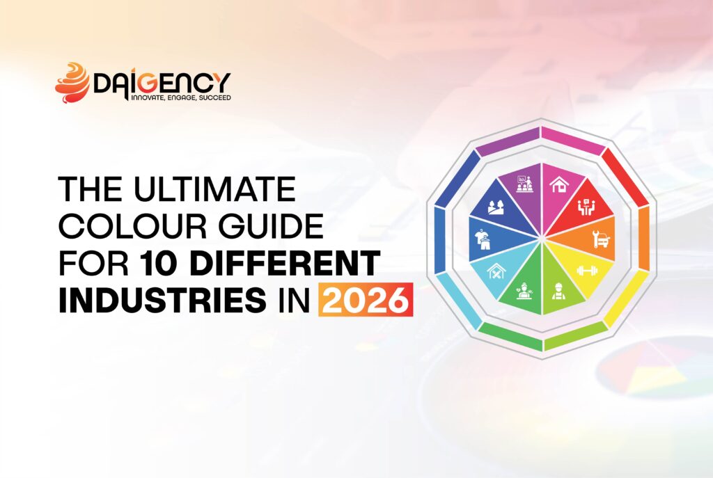
The Industry Breakdown: Right Color, Right Identity
We have analyzed the world’s leading industries and curated the best Color Options tailored to their specific character. Whether you are launching a new startup or looking to ‘Rebrand’ an existing business, these selections will help you carve out an ‘Elite’ position in the market. Selecting a color for your brand is not just a design choice; it is a business strategy. Below, we break down 10 key industries, the colors that define them, and the psychological reasons why these choices are vital for your success.
The Industry Deep Dive: Choosing Your Strategic Palette
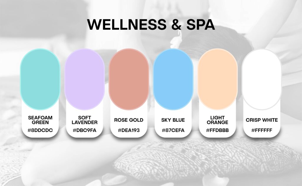
1.Wellness & Spa: The Ultimate Sanctuary
The Vibe: Peace, Purity, and Rejuvenation.
The Colors: Seafoam Green, Soft Lavender, Rose Gold, Sky Blue, Light Orange, and Crisp White.
Why these colors & their Importance?
Seafoam Green:
Reason: This shade is the ultimate symbol of “Healing” and “Nature.”
Importance: It provides visual comfort to the eyes and is scientifically proven to reduce
stress levels instantly.
Soft Lavender:
Reason: Lavender is biologically linked to relaxation and deep sleep.
Importance: It helps eliminate anxiety and creates a “Zen” atmosphere for your clients.
Rose Gold:
Reason: This represents “Modern Luxury” and elegance.
Importance: It prevents your brand from looking outdated, making it feel “Premium” and “Trendy.”
Sky Blue:
Reason: It evokes the calming essence of fresh water and open skies.
Importance: It builds “Trust” and helps regulate the customer’s heart rate for a deeper state of calm.
Light Orange:
Reason: This color represents “Renewed Energy” and the warmth of a sunrise.
Importance: It provides a sense of “Vitality” and hope, helping tired clients feel refreshed and alive.
Crisp White:
Reason: White is the ultimate symbol of “Purity,” “Clarity,” and “Sterility.”
Importance: In a Spa, it gives the customer confidence in your hygiene and creates a “Breathable,” open space that feels light and clean.
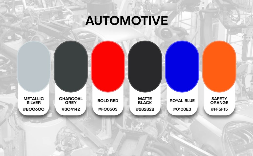
2.Automotive: Speed, Power & Precision
The Vibe: Innovation, Durability, and High-Performance.
The Colors: Metallic Silver, Charcoal Grey, Bold Red, Matte Black, Royal Blue, and Safety Orange.
Why these colors & their Importance?
Metallic Silver:
Reason: Silver is the universal symbol of “Modern Technology” and futuristic engineering.
Importance: It gives your brand a “High-Tech” feel and makes your machinery or services look sleek and polished.
Charcoal Grey:
Reason: This shade represents “Strength,” “Solidity,” and industrial power.
Importance: It signals to the customer that your brand is “Reliable” and built to last, providing a professional and serious corporate look.
Bold Red:
Reason: Red is biologically linked to “Adrenaline,” “Speed,” and “Excitement.”
Importance: It triggers an emotional response that suggests high performance and energy, perfect for grabbing immediate attention in a crowded market.
Matte Black:
Reason: Black represents “Raw Power,” “Authority,” and “Mystery.”
Importance: In the automotive world, matte black is the ultimate sign of “Luxury” and “Stealth,” making your brand look incredibly premium and dominant.
Royal Blue:
Reason: Blue is the global color for “Trust,” “Precision,” and “Security.”
Importance: It assures the customer that your engineering is accurate and that they can trust their safety in your hands.
Safety Orange:
Reason: This is a high-visibility color used for “Caution” and “Action.”
Importance: It adds a modern, “Sporty” edge to the brand and is excellent for highlighting road-side assistance or high-performance parts.
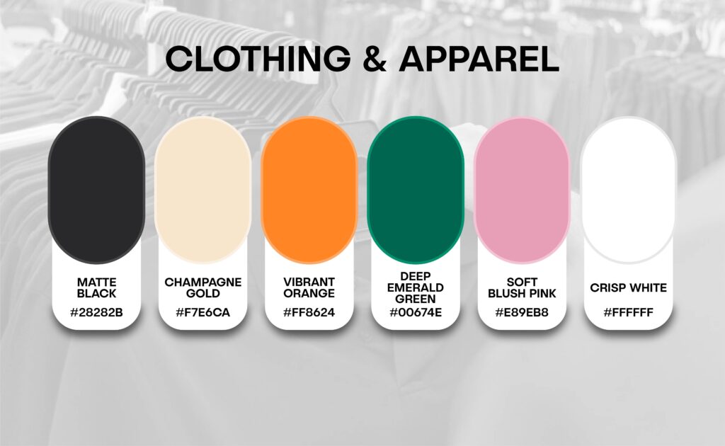
3. Clothing & Apparel: Identity, Style & Trend
The Vibe: Fashion-forward, Personality, and Sophistication.
The Colors: Matte Black, Champagne Gold, Vibrant Orange, Deep Emerald Green, Soft Blush Pink, and Crisp White.
Why these colors & their Importance?
Matte Black:
Reason: Black is the timeless symbol of “Authority,” “Elegance,” and “Mystery.”
Importance: It makes any clothing brand look “High-End” and expensive. It is the perfect backdrop that allows the actual colors of your clothes to stand out.
Champagne Gold:
Reason: This is a softer, more modern version of gold that represents “Exclusivity” and “Refinement.”
Importance: It adds a touch of “Elite Luxury” to your logo or tags, telling the customer that they are buying a premium, high-quality product.
Vibrant Orange:
Reason: Orange is the color of “Creativity,” “Social Connection,” and “Energy.”
Importance: In fashion, it represents “Streetwear” and “Bold Trends.” It grabs immediate attention and makes your brand look youthful and “Active.”
Deep Emerald Green:
Reason: This rich shade represents “Nature,” “Growth,” and “Timeless Sophistication.”
Importance: It gives a “Royal” and stable feel to the brand. It is perfect for sustainable fashion or classic, high-quality formal wear.
Soft Blush Pink:
Reason: This represents “Softness,” “Approachability,” and “Compassion.”
Importance: In modern apparel, it is no longer just for women; it represents “Modern Aesthetic” and “Comfort,” making the brand feel welcoming and trendy.
Crisp White:
Reason: White is the universal sign of “Simplicity,” “Clarity,” and “Minimalism.”
Importance: It creates a “Breathable” and clean shopping experience. It signals that your brand is honest, fresh, and focuses on “Quality over Quantity.”
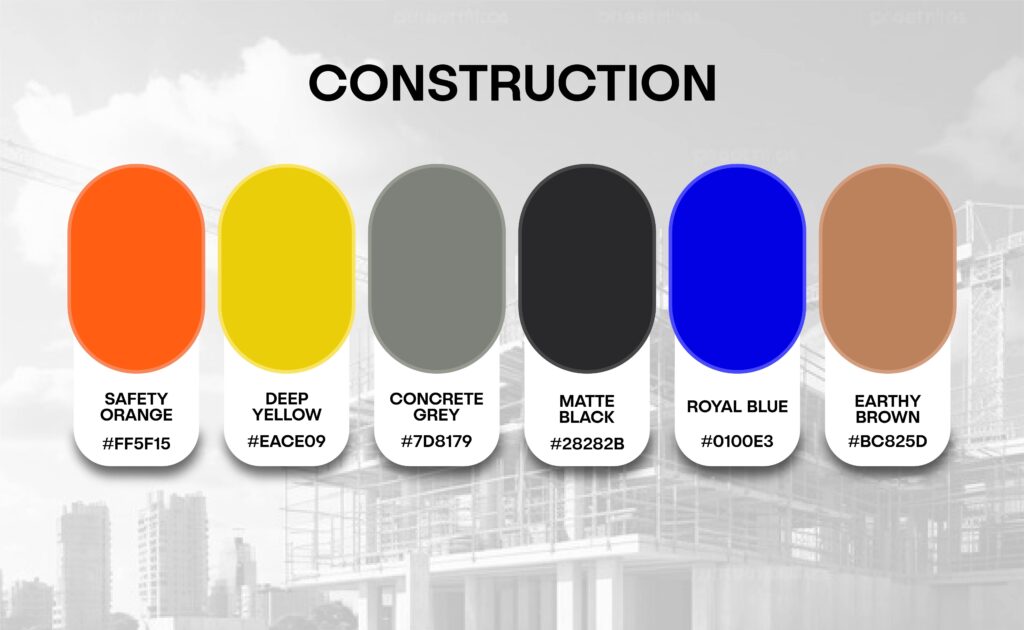
4.Construction: Strength, Safety & Reliability
The Vibe: Stability, Durability, and Solid Engineering.
The Colors: Safety Orange, Deep Yellow, Concrete Grey, Matte Black, Royal Blue, and Earthy Brown.
Why these colors & their Importance?
Safety Orange:
Reason: This is the global color for “High Visibility” and “Caution.”
Importance: It grabs immediate attention and tells the client that you prioritize “Safety” and “Active Work” on-site.
Deep Yellow:
Reason: Yellow is the traditional color of “Heavy Machinery” and construction energy.
Importance: It represents “Optimism” and “New Construction,” showing that your brand is energetic and ready to build.
Concrete Grey:
Reason: This color represents “Cement,” “Stone,” and the “Foundation” of a building.
Importance: It gives a feeling of “Stability” and “Strength,” assuring the client that your structures are built to last forever.
Matte Black:
Reason: Black is the symbol of “Power,” “Authority,” and “Sophistication.”
Importance: It gives your brand a “Professional Corporate” look, proving that you can handle big, high-end projects.
Royal Blue:
Reason: Blue is the universal color for “Trust” and “Expertise.”
Importance: It makes the customer feel “Secure” that their investment and their building are in the hands of experts.
Earthy Brown:
Reason: This represents “Soil,” “Wood,” and the “Earth’s Foundation.”
Importance: It provides a “Reliable” and “Organic” feel, connecting your construction work to a solid, natural base.
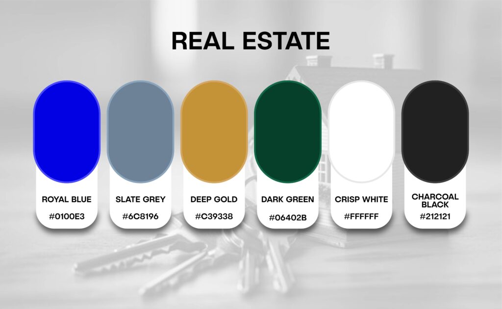
5.Real Estate: Trust & Investment
The Vibe: Security, Luxury, and Success.
The Colors: Royal Blue, Slate Grey, Deep Gold, Dark Green, Crisp White, and Charcoal Black.
Why these colors & their Importance?
Royal Blue:
Reason: This color is the global symbol for “Trust” and “Honesty.”
Importance: Buying a home is a big decision. Blue makes the customer feel “Safe” and “Secure” with their money.
Slate Grey:
Reason: This represents “Modern Buildings” and “Solid Foundations.”
Importance: It gives your brand a “Professional” and “Serious” look, showing that you are an expert in the property market.
Deep Gold:
Reason: Gold represents “Wealth,” “Success,” and “Luxury.”
Importance: It tells the client that your properties are “High-Value” and a “Premium Investment” for their future.
Dark Green:
Reason: Green is the color of “Growth” and “Prosperity.”
Importance: It suggests that the property value will “Grow” over time, making it an attractive choice for investors.
Crisp White:
Reason: White stands for “Clarity,” “Purity,” and “Fresh Starts.”
Importance: It makes your brand look “Clean” and “Honest,” giving the client a feeling of a “New Beginning” in a new home.
Charcoal Black:
Reason: Black represents “Power,” “Class,” and “Authority.”
Importance: It adds an “Elite” touch to your brand, making it stand out as a leader in the real estate industry.
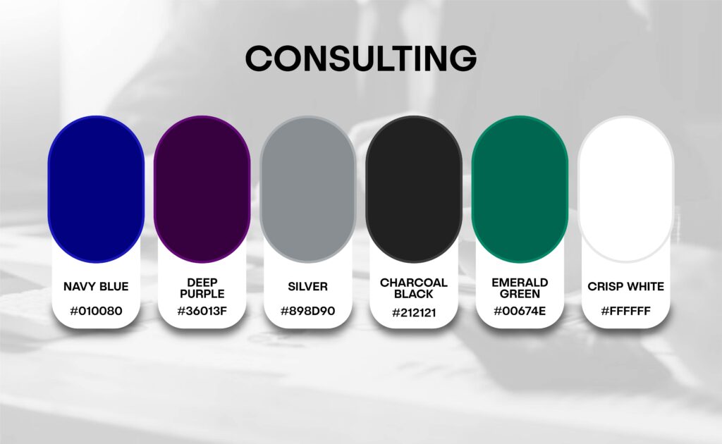
6.Consulting: Expertise, Strategy & Authority
The Vibe: Knowledge, Leadership, and Business Growth.
The Colors: Navy Blue, Deep Purple, Silver, Charcoal Black, Emerald Green, and Crisp White.
Why these colors & their Importance?
Navy Blue:
Reason: This is the ultimate color for “Professionalism” and “Corporate Power.”
Importance: It builds instant “Trust.” In Consulting, it tells the client that you are a serious and stable partner for their business.
Deep Purple:
Reason: Purple has always been the color of “Wisdom” and “Deep Thinking.”
Importance: It gives your brand a “Sophisticated” look, showing that you provide creative and “High-Value” solutions.
Silver:
Reason: Silver represents “Modern Technology” and “Efficiency.”
Importance: It makes your brand look “Sleek” and “Up-to-date,” suggesting that your advice is based on the latest market trends.
Charcoal Black:
Reason: Black stands for “Authority,” “Class,” and “Leadership.”
Importance: It adds an “Elite” touch to your brand, making you look like an industry leader who knows exactly what they are doing.
Emerald Green:
Reason: Green is the color of “Financial Growth” and “Prosperity.”
Importance: It subtly tells the client that working with you will help their “Business Grow” and increase their profits.
Crisp White:
Reason: White represents “Clarity,” “Truth,” and “Simplicity.”
Importance: It suggests that your consulting process is “Transparent” and easy to understand, giving the client a clear path to success.
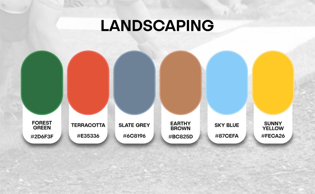
7.Landscaping: Nature, Growth & Outdoor Living
The Vibe: Freshness, Sustainability, and Natural Beauty.
The Colors: Forest Green, Terracotta, Slate Grey, Earthy Brown, Sky Blue, and Sunny Yellow.
Why these colors & their Importance?
Forest Green:
Reason: This is the ultimate symbol of “Nature,” “Life,” and “Freshness.”
Importance: In landscaping, this color is essential because it immediately connects the client to greenery and a healthy outdoor environment.
Terracotta:
Reason: This earthy orange represents “Clay Pots,” “Tiles,” and “Hardscaping.”
Importance: It adds a “Warm” and “Rustic” touch to your brand, making your garden designs feel welcoming and beautifully crafted.
Slate Grey:
Reason: This represents “Stone,” “Pavement,” and “Modern Structures.”
Importance: It gives your brand a “Professional” and “Solid” look, assuring clients that your construction and stone work are durable and modern.
Earthy Brown:
Reason: The color of “Soil,” “Mulch,” and “Natural Wood.”
Importance: Brown represents “Reliability” and “Stability.” It shows that your work is grounded, organic, and built on a strong foundation.
Sky Blue:
Reason: Represents the “Open Sky” and “Water Features” like ponds or pools.
Importance: It brings a sense of “Peace” and “Tranquility” to your brand, suggesting that your designs offer a relaxing escape from daily stress.
Sunny Yellow:
Reason: The color of “Sunlight” and “Blooming Flowers.”
Importance: Yellow adds “Energy” and “Optimism.” It makes your brand look friendly and bright, instantly lifting the mood of your potential clients.
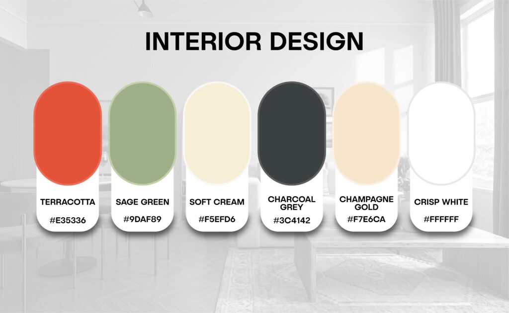
8.Interior Design: Aesthetic, Balance & Harmony
The Vibe: Creativity, Modern Living, and Personal Style.
The Colors: Terracotta, Sage Green, Soft Cream, Charcoal Grey, Champagne Gold, and Crisp White.
Why these colors & their Importance?
Terracotta:
Reason: This is an “Earthy” and “Warm” color that represents clay and natural materials.
Importance: It makes a space feel “Welcoming” and “Organic,” showing that your designs are connected to nature and comfort.
Sage Green:
Reason: This is a soft, muted green that represents “Balance” and “Peace.”
Importance: It creates a “Zen” environment, telling the client that you can turn any house into a peaceful sanctuary.
Soft Cream:
Reason: Cream is the color of “Softness” and “Timeless Elegance.”
Importance: It makes a room look “Larger” and “Brighter,” giving a feeling of high-end luxury without being too loud.
Charcoal Grey:
Reason: This represents “Modernity,” “Structure,” and “Sophistication.”
Importance: It gives your brand a “Professional” and “Bold” look, proving that you are an expert in contemporary and urban design.
Champagne Gold:
Reason: This is the ultimate color for “Luxury” and “Refined Taste.”
Importance: It adds an “Elite” touch to your brand, signaling that your designs are high value and exclusive.
Crisp White:
Reason: White stands for “Clarity,” “Minimalism,” and “New Beginnings.”
Importance: It represents a “Clean Slate,” showing that you can transform any messy space into a beautiful, organized masterpiece.
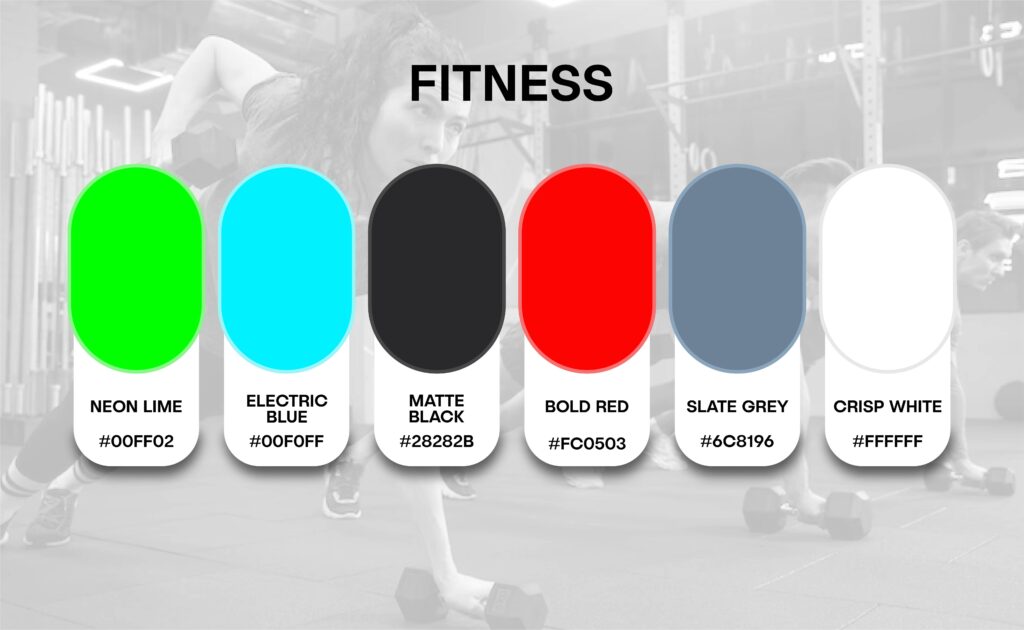
9.Fitness: Motivation, Power & Transformation
The Vibe: High Energy, Strength, and Active Lifestyle.
The Colors: Neon Lime, Electric Blue, Matte Black, Bold Red, Slate Grey, and Crisp White.
Why these colors & their Importance?
Neon Lime:
Reason: This is a high-energy color that represents “Vitality” and “Freshness.”
Importance: It grabs immediate attention and triggers “Adrenaline,” making it perfect for a brand that wants to look fast and modern.
Electric Blue:
Reason: This represents “Intensity,” “Focus,” and “Strength.”
Importance: It builds “Trust” while keeping the energy high, suggesting that your fitness programs are professional and result-oriented.
Matte Black:
Reason: Black is the ultimate symbol of “Raw Power” and “Authority.”
Importance: It gives your brand a “Hardcore” and “Elite” feel. It tells the customer that your gym or brand is a place for serious transformation.
Bold Red:
Reason: Red is biologically linked to “Increased Heart Rate” and “Action.”
Importance: It creates a sense of “Urgency” and “Passion,” motivating people to push their limits and start their workout.
Slate Grey:
Reason: This color represents “Iron,” “Steel,” and “Durability.”
Importance: It gives a “Solid” and industrial look to your brand, reassuring the client that your equipment and methods are built on a strong foundation.
Crisp White:
Reason: White stands for “Clarity,” “Hygiene,” and “Fresh Starts.”
Importance: In a fitness setting, it makes your space look “Clean” and “Open,” giving the client a feeling of a healthy and organized environment.
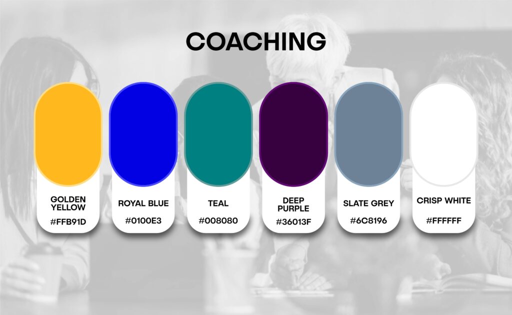
10. Coaching: Leadership, Vision & Success
The Vibe: Clarity, Inspiration, and Personal Transformation.
The Colors: Golden Yellow, Royal Blue, Teal, Deep Purple, Slate Grey, and Crisp White.
Why these colors & their Importance?
Golden Yellow:
Reason: Yellow is the color of “Optimism,” “Happiness,” and “Bright Ideas” (like a lightbulb).
Importance: It creates a feeling of “Hope” and positivity, making the client believe that a better future is possible with your guidance.
Royal Blue:
Reason: Blue is the global symbol for “Trust,” “Logic,” and “Intelligence.”
Importance: It assures the client that you are a “Professional Authority” and that your advice is based on solid facts and experience.
Teal (Blue-Green):
Reason: Teal represents “Mental Clarity” and “Emotional Balance.”
Importance: It helps calm the client’s mind, showing that your coaching will help them find “Peace” and “Focus” in their busy lives.
Deep Purple:
Reason: Purple has always been associated with “Wisdom,” “Ambition,” and “Deep Thinking.”
Importance: It gives your coaching brand an “Elite” and “Sophisticated” look, suggesting that you offer high-value, expert-level insights.
Slate Grey:
Reason: Grey stands for “Neutrality,” “Balance,” and “Professional Maturity.”
Importance: It provides a “Solid Foundation” to your brand, showing that you are a serious and grounded coach who stays calm under pressure.
Crisp White:
Reason: White represents a “Fresh Start,” “Honesty,” and “Simplicity.”
Importance: It signals a “New Chapter” in the client’s life, making your coaching process feel transparent, clean, and easy to follow.
For most people, that choice is driven by visual appeal specifically, the color palette. From the packaging to the logo, the colors chosen to represent a brand define how your audience perceives it. Think of these colors as a silent ambassador for your brand’s identity, personality, and its connection to the target consumer. This is why selecting colors for a product shouldn’t be a random choice; they play a vital role in shaping the brand’s image and directly influencing sales performance. Drawing from our extensive experience in brand development across various industries, we’ve crafted this guide to help you select the colors that best represent your brand.
If you are currently in the process of creating a logo, designing a website, or deciding on product packaging, this guide is an essential resource for defining your business’s visual identity.
Global Industry Color Trends
USA Tech Companies: Dominating with Royal Blue & Matte Black for innovation and trust.
UK Beauty & Aesthetics: Leading the market with Rose Gold & Soft Blush Pink for premium elegance.
UAE Real Estate: Defined by Deep Gold & Charcoal Grey to signal luxury and high-value investment.
Canada Wellness Centers: Utilizing Seafoam Green & Earthy Brown for organic healing and nature.
USA & UK Finance Consulting: Relying on Navy Blue & Silver for corporate authority and precision.
Germany Automotive Brands: Focused on Metallic Silver & Slate Grey for futuristic engineering.
France Fashion & Apparel: Setting trends with Matte Black & Champagne Gold for elite sophistication.
Australia Landscaping: Using Forest Green & Terracotta to reflect sustainable and earthy designs.
Global Fitness Brands: Driving energy with Bold Red & Neon Lime for high-performance motivation.
European Interior Design: Moving towards Sage Green & Soft Cream for modern, balanced living.
How to Choose Your Brand Color?
1.Identify your target audience.
2.Define your brand’s personality (Cool, Bold, or Calm).
3. Test your colors on different screens (Mobile vs Laptop).
The 60-30-10 Rule:
The Secret to a Balanced Brand.
In professional branding, the 60-30-10 Rule is the gold standard for creating a visual identity that looks expensive and well-organized. To achieve an “Elite” look, your palette should be divided as follows:|
60% Primary (Base) Color: Use a Neutral shade like Crisp White or Soft Grey. This creates a clean, breathable foundation for your website and marketing materials.
30% Secondary Color: Use your main brand color (such as Royal Blue or Forest Green) to build your identity and define your industry presence.
10% Accent Color: Use a Bright or “Pop” color like Golden or Bold Red. This should be used sparingly for your logo, buttons, and “Call to Action” highlights.
Why Does This Matter?
This specific balance is what makes a brand look “Professional” and “High-End.” Without this ratio, a design can easily look messy, cluttered, or confusing to the customer’s eye. By following this rule, you ensure your brand communicates Authority and Clarity at first glance.
Ready to Elevate Your Brand’s Visual Identity?
At Daigency, we believe that design is the silent ambassador of your brand. We don’t just pick colors; we engineer Visual Experiences that build trust and drive growth. Whether you are launching a new startup or rebranding an established business, our team of experts is here to ensure your brand looks Elite, Modern, and Professional. From strategic color psychology to high-end web development and digital marketing, Daigency is your partner in turning a “business” into a powerful “Brand”.
Button: Get a Free Branding Consultation with Daigency